Share this:


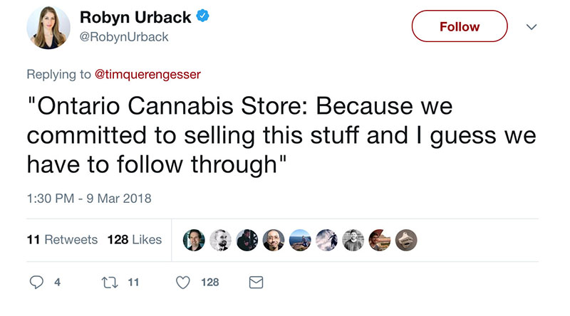
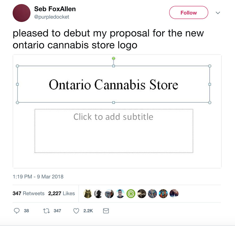
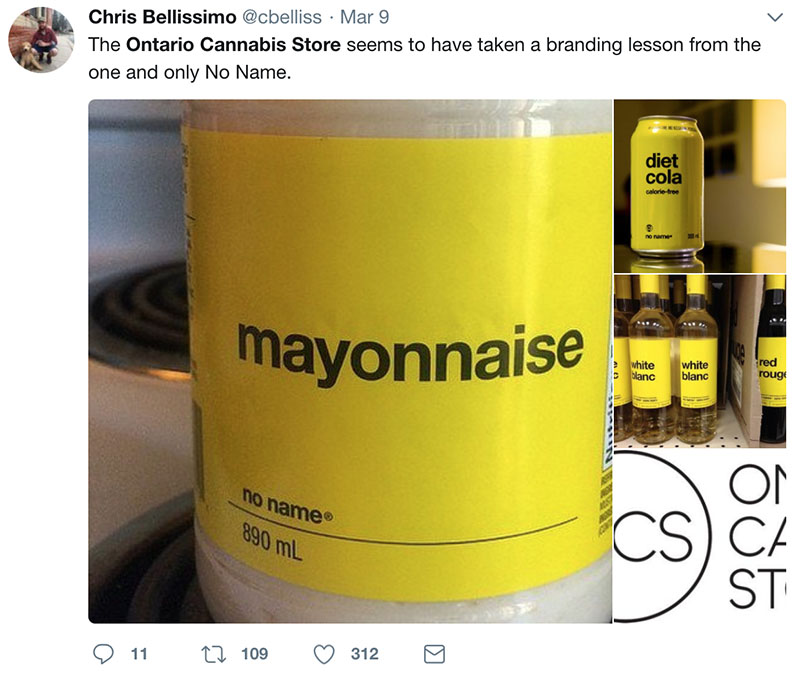
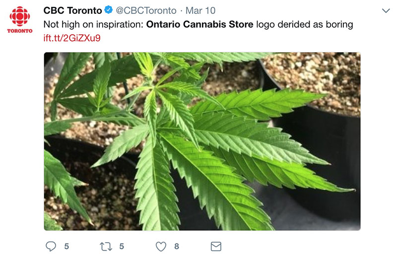
After being revealed on Friday, the overall consensus for the new Ontario cannabis logo is not a very positive one. The pot-selling agency will be called, the Ontario Cannabis Store (or OCS for short) and its logo to represent it is a very minimalist, sans-serif black and white design. Side note, the logo cost around $650,000. People are outraged, of course.
According to CTV News, “the team behind the branding said the design was intended to convey a safe, simple, and approachable environment.” MAJOR emphasis on the safe. It’s a big difference from the design approach for the LCBO design, which has much more detail.
Everyone is taking on Twitter to share their thoughts and feelings on the logo and name:

Source: CTV News
What do you think of the new OCS logo? Let us know in the comment section.
Posts you might be interested in:
LCBO Announces Plans To Work With Shopify For Online and Mobile Cannabis Sales
Ontario To Create an “LCBO” For Marijuana – Set To Open 60 Stores in 2018
LCBO Starts Selling Online With Home Delivery
I Went On a Spending Detox and Saved $150 in a Week
Grocery Stores To Expand Their Beer, Cider and Wine Selection in the GTA